Your brand is one of the most important assets of your business. No matter how great your product or service is, if your brand is weak or misguided, you’re going to have a hard time differentiating yourself in the market and connecting with your target audience. We just recently rebranded here at Proposify and we want to share the what, why, and how we did it.
A strong brand can help you survive the roller coaster of the business world. It builds connection, loyalty, fans, and champions. The right brand strategy can turn customers into ambassadors. It can help you win the unwinnable price war.
Your brand can provide a roadmap for making decisions about your marketing strategy, public relations, product/service development, customer support, communications, hiring, and employee performance.
Here at Proposify, we’ve just completed a rebrand that we’re pretty pumped about. We did all the work in-house and not only are we proud of the result, we feel it accurately represents who we are as a company and how we hope to be perceived by our stakeholders - our customers, potential customers, partners, investors, and employees, present and future.
In this post, I’ll share the process we followed to get to this point, although if you know anything about brand, you know it’s always evolving, always being shaped by interactions with your stakeholders.
So right now it’s like we just drove our shiny new car off the lot, but it’s got lots of road to travel and adventures ahead.
Brand Agreement
If there’s a hall of fame award for the term most misunderstood by clients, I’d cast my not-so-secret ballot for “branding”. And I’ll take a good guess that if you work at an agency that offers branding services, your vote might swing the same way.
So just to be sure we’re all on the same page before I dive into our branding process, I’m going to lay out how I define brand based on my experience developing brands for businesses from a cross section of industries.
What a brand isn’t:
- A logo
- A tagline
- A product
These are all representations of a brand, vehicles through which to communicate the brand, but none of these are the brand in and of itself.
This is where a lot of clients get tripped up. They’ll come to you saying they want to rebrand but all they really want is a new logo colour.
What a brand is:
To me, true branding is about the promise of an experience.
To be successful, that experience must be delivered consistently.
It’s about creating a distinct, memorable impression.
It’s about setting an expectation.
Brand lives in the hearts and minds
The truth is, it doesn’t matter what people think about you or your business. What matters is how you make them feel about themselves and their decisions while in your presence. Do you make them feel smart? Sexy? Frugal? Responsible? Informed? Accepted?
One brand can make two people feel very differently about themselves, depending on their own perceptions and experiences.
For example, I am a committed Apple customer. My relationship with Apple started back in the 80’s when my dad was one of the first Apple dealers in our region. I grew up absorbing my dad’s admiration and enthusiasm for Steve Job’s vision, our family took vacations to places where my dad could attend Apple-related conventions, and Apple put food on our table, so to speak.
Apple definitely made it into the hearts and minds of my family.
Over the years this connection deepened as I developed my own appreciation for all things Apple: their design sensibility, their commitment to simplicity and to making technology feel more human. To me, Apple makes me feel smart, creative, and cool, plus there’s a deep-rooted connection with my family.
My husband on the other hand? That’s not how Apple makes him feel.
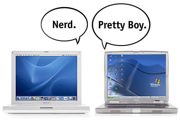
He feels Apple is overpriced, pretentious, and complicated, and he thinks people are like sheep to Apple’s cult-like status. He likes his functional PC laptop and that makes him feel smart, thrifty, and non-conforming.
One brand, two experiences.
Why We Rebranded
Some of you may already know the story about how Proposify came to be. If you don’t, our friends at Groove published a great post about the personal and professional journey of our CEO, Kyle Racki that led to Proposify.
In short, Kyle wanted to create an easier way for marketing agencies and freelancers to create winning proposals. He had experienced the pain of the proposal process himself, as an agency designer, as a freelancer, and then as an agency owner. He knew it could be better, it had to be better.
Proposify is still a young company, a startup largely bootstrapped by Kyle and our co-founder, Kevin Springer. Kyle himself did the original logo design, the look and feel of the website, all the visual elements to get things up and running. It looked clean, simple, and it addressed an agency crowd, especially freelancers.
There wasn’t the time or resources when Proposify first launched to invest in a full brand strategy. Fortunately, as a designer, Kyle knew how to establish Proposify’s initial image positively in the marketplace.
And we all grew fond of the Proposify freelancer:

Before I joined Proposify, I totally related to this image of a casually dressed woman working in a cafe. I had been a freelancer for several years. I dressed casually, I worked in cafes. Proposals were a nightmare both when I worked at agencies and when I was out on my own. This cool girl was getting it done. I wanted to be cool and get it done.
But like any good CEO, Kyle’s vision for Proposify evolved, his knowledge of the marketplace grew, and his understanding of who had a proposal problem and how it could be solved deepened.
Proposify isn’t just for freelancers and it isn’t just about proposals. It’s about making the sales process easier for anyone who needs to create a proposal to generate new business. That could be agency owners, sales managers, entrepreneurs, account directors, professional consultants, and yes, still some freelancers.
It was time to differentiate Proposify more in the marketplace and find a new way to connect with our target audience that would set us apart from the competition.
That’s the thing I love about branding; in a sea of sameness where customers find it hard to discern one product over the other, your brand, done right, can be your competitive tipping point.
It was time for Proposify punch out, to create an expectation, to burrow into those hearts and minds.
The Branding Process
I was really excited to lead Proposify’s rebranding process.
As I mentioned earlier, developing brand strategies is something I had done in both my agency work and as a freelancer. I loved educating clients about brand, leading them through the process, working with a team to develop a strategy, and overseeing the execution. As a writer, I think it’s the storytelling aspect of branding that really appeals to me, creating that emotional connection.
Plus, Kevin and Kyle are longtime friends and colleagues. We worked together at agencies back in the day, they hired me on lots of projects when they had their own agency, and I cheered from the sidelines when they first hatched Proposify.
Now I’m a team member. I have a passion for, and connection with, this company, its vision, and my co-workers. Among all the branding projects I’ve worked on over the years, this one was extra special.
Step 1: Brand Discovery Session
I think it’s critical to have a broad cross section of representatives of a business at the discovery session. Management, sales, marketing, customer service, product developers, etc.
Sometimes clients would just send their executive level people but I think it’s important to the success of a branding project to involve different departments right from the beginning. One, it gives you a chance to mine more information about the company; and two, it helps ensure buy-in down the road because people feel part of the process.
When we did our discovery session, Proposify only had six employees, plus Kevin and Kyle (as of December 2016, we’re at 15). We decided everyone should be part of this session.
One of the things I love most about the Proposify team (other than the fact they’re a bunch of weirdos) is that they’re all super committed to Proposify and very enthusiastic. These are heart and soul kind of people.
While no one on the team other than Kevin and Kyle had been part of a branding exercise before and therefore had no idea what to expect, everyone was keen and excited.
We scheduled off a Friday afternoon (keeping one eye on the support queue, of course), I made sure there were lots of fun snacks, we wrestled up a flip chart, and we dove in.
I always like to start every brand session with a new client similarly to how I started this blog post - by explaining what a brand is and isn’t, and what it needs to do. This was especially important with the Proposify team since none of them had any experience in this realm and I wanted everyone to feel comfortable, informed, and prepared.
Over the next three hours we went through a series of questions that are designed to get to the core of who a business is, its values, and those of its target audience. I’ve used this list of questions for many years as a guide for brand discovery sessions, customizing for each specific client and project, and always going off on valuable tangents and digging deeper when needed.
Here’s a link to my general list of branding questions - feel free to adapt and use for your own needs.
Happily, everyone in the Proposify brand discovery session was very engaged, sharing both thoughtful and insightful answers.
Combined with the research I had already done on the competitive landscape and our target audience, I was well-armed as I went underground to work on the next phase.
Step 2: The Sausage Machine
I can’t remember exactly when I started to refer to this part of the process as ‘the sausage machine’ but for years it seemed an apt description for what happens after I compile all the information from the brand discovery and my own research. I jam it all into the sausage machine, AKA my brain, and try to crank out something fully formed and tangible.
Practically speaking, this stage is where I look at what the target audience thinks now — not just about Proposify but also about proposals and proposal software in general — compare that with we how we want them to think, and then figure out what has to happen to make the two meet.
The result is to present the “essence” (flakey word, I know) of the brand, or what I like to call the brand code. It might be a single word, or maybe several characteristics that provide a foundation for the best way to communicate the unique personality of Proposify so it resonates with our stakeholders in tone, images, messaging, and medium.
This part of my brand development process is heavily inspired by The Culture Code: An Ingenious Way to Understand Why People Around the World Live and Buy as They Do.
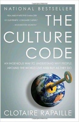
Author Clotaire Rapaille is a world-renowned cultural anthropologist and marketing expert who has worked with some of the world’s biggest brands (Jeep, Chrysler, Folgers, Honda) to help launch products, design advertising campaigns, and connect with their target audiences.
His theories on how people think and act differently around the world, and the power of cultural influences on our buying habits transformed how I approach the branding process. I can’t recommend this book enough, whether you’re in marketing, sales, or just up for a very fascinating read. It’s my all-time favourite business book.
The sausage machine stage is definitely a beautiful, frustrating, and mysterious marriage of art and science. I combine facts with feelings and then try to produce a tangible representation. Sometimes it comes quickly and clearly, and other times I worry I’ll never have another good idea again, that I’m a washed-up has-been.
I have learned over the years to trust the process, and my brain, telling myself the answer WILL come. And eventually, excruciatingly sometimes, it does.
Step 3: The Brand Code
I suppose since the last step involved cramming everything into the sausage machine, this stage might more accurately be called “The Sausages”. But ‘brand code’ sounds a little more professional, doesn’t it?
If we refer back to our original definition of brand being about the promise of an experience, what could possibly represent Proposify’s promise?
What could be Proposify’s brand code?

Proposify’s brand code: James Bond’s Q.
For those of you unfamiliar with the character of Q, he runs the MI6 research and development department. He’s the genius inventor who creates all the cool gadgets that helps James Bond save the world (and himself).
Our customers, similar to James Bond, are out in the field, chasing opportunities and leads, taking risks, and trying to complete their mission of closing deals. Meanwhile Proposify, like Q, is behind the scenes, developing the technology to empower them to close those deals, and safely complete their mission.
The newest Q is young, tech savvy, he’s focused on results, and his whole purpose is to help 007 be successful. Modern Q is rocking some geek chic and he’s a got a wry sense of humour. He’s very much like the people working at Proposify.
Here’s why Q is Proposify’s brand code and represents our promise of an experience:
- He helps Bond out in the most crucial times.
- His cutting edge technology has saved Bond’s life more than once.
- He is dedicated to ingenuity, innovation, and helping Bond complete his mission.
When I looked at some of the comments that came out of the branding session with our team about what Proposify does for its customers, it reminded me exactly of what Q does for James Bond:
“We use innovation and technology to help our customers complete their mission.”
“We save their asses.”
“We are their secret weapon.”
(and those last two statements are based on real quotes from our customers)
This is exactly how we want people to feel about Proposify.
Brand attributes
Comparing words that came up during the brand discovery to describe Proposify with my perception of the personality of Q, I developed a list of attributes and statements that contextualized those attributes in relation to Proposify:
Simple
Every day we make it easier for our customers to use Proposify and easier to understand why we should be their #1 choice.
We’re straightforward in our language, uncomplicated in our process, and clear in our objectives.
Refined
In both big and small ways, we’re constantly improving what we do and how we do it.
We strive for a level of sophistication in our expertise, our software, and our company.
Sharp
We’re savvy about industry, our technology, and our customers.
We’re quick to adapt, respond, and innovate.
Design-focused
We understand that good design improves user experience.
Good design starts by understanding our customers, their business, and their clients.
Zen
Proposify is a place of calm and order in the chaos of our customer’s world.
We are calm, patient, and solutions-oriented.
Witty
We’re funny people who like to have fun.
We should inject smart and respectful humour wherever and whenever it’s appropriate. Which is pretty much always and everywhere.
Brand promise
Next, I developed two statements that summarized Proposify’s brand promise:
Using our expertise in technology and sales, Proposify is the secret weapon that makes it easier and faster for our customers to complete their mission of closing more deals.
As a team, we are the secret weapon that helps Proposify achieve its mission of innovation, growth, happiness, and world domination.
Step 4: The Execution
Once we had articulated the emotional attributes of the brand, the next stage was to interpret them visually.
That’s where Proposify’s designer extraordinaire, Steve Huntington, got involved. I’m going to turn this section over to Steve so you can learn about his design process straight from the horse’s mouth:
— — — — — — — — — — — — — — — — — — — — — — — — — —
Thanks Jen, and hello Proposifiers! I’m going to give you a behind-the-scenes look at the process of rebranding Proposify. I’m going to start with some thoughts on the approach we took in approaching the redesign.
It’s natural whenever you try to improve something, whether in your professional or personal life, to want to throw away what you have and start from scratch.
When you live with something for so long, its appeal and lustre start to wear off and you begin to notice the flaws more and more. After long enough time, you just want to get rid of it and replace it with something completely different.
Out with the old, and in with the new, right?
This effect applies to brands as well. As a designer there’s always a temptation to forego what already exists for a brand and craft something wholly new. It’s part of wanting to make your mark as a creative person. And it’s never stronger than when redesigning your own brand.
The trick is to keep that energy and desire to re-invent, but not lose sight of what worked about the brand in the first place.
There’s a great interview with one of my favourite poster designers, Olly Moss, about his design process and philosophy when designing modern posters for classic movies.
“I think for me the main thing is to not ignore it, not try to do something totally different, because I think that’s a mistake. Things are iconic for a reason…”
That little nugget of wisdom is something I’ve tried to keep in mind my whole career, and it was integral to Proposify’s rebranding.
There was a lot that worked about our old brand, and a lot of recognition and connection had been established with our customers. To get rid of that would have been a mistake. We didn’t need to redesign the visual brand. We needed to refresh it.
The Logo
Using that compass to navigate the process, I made the decision early on that the check mark and coffee cup were here to stay. The check mark is a universal sign of both positivity and winning (as in winning deals), two of the core messages we want to convey with our brand.
And we had agreed to keep “Coffee is for Closers” as our rallying cry and part of our company culture.
(side note: as someone who doesn’t drink coffee, the amount of caffeine consumed in this office is alarming sometimes. You should see the panic that sweeps through here when we run out of coffee cream).
In case you need a refresher, here’s our old logo:
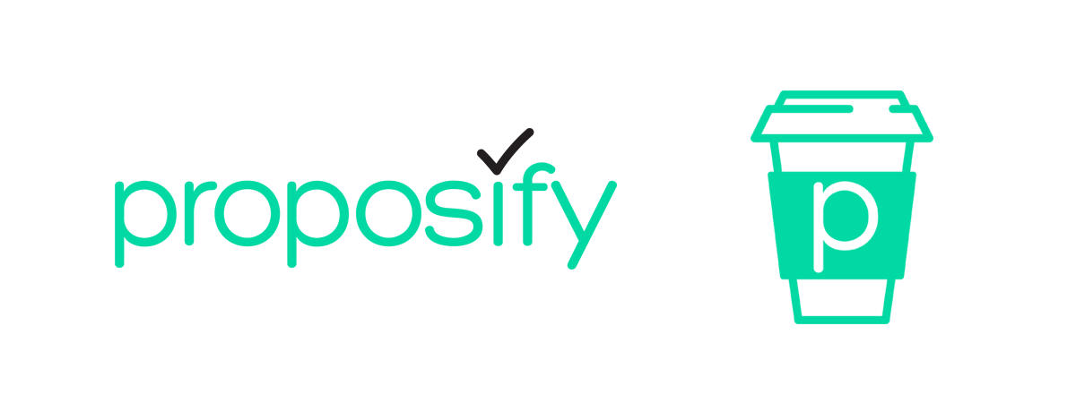
The first explorations of the logo were an attempt to take those elements and reshape them into something different from our existing word mark. And like all early work for any redesign the results can be…interesting.
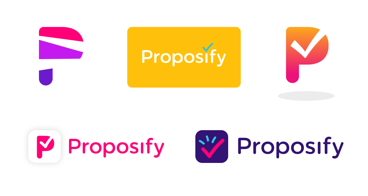
there’s some serious cringing going on over here.
Pretty quickly I realized that the further I moved away from from what we had, the less the designs worked for me. The logo was already iconic in its simplicity, so instead of reinventing the wheel I focused on refining what already existed.
This part of designing a logo is a lot like a traditional craft, say woodworking or sculpture. Choosing a typeface, customizing the shape, spacing, and alignment. Chiselling it down until the pieces all fit together and everything works as a whole.

Gone are the rounded edges and the teal (more on that later) for a cleaner, sharper typeface and style. And we finally earned that capital “P” — Proposify is all grown up, folks.
But a brand is so much more than just a logo; the real work starts when you create the environment for the logo to live in.
The Look & Feel
The aesthetic, more than the logo, is what really separates a good brand design from a bad one. It’s a tricky process. And there’s no universal set of rules on what style, look, or feel is best when it comes to branding.
Your brand’s aesthetic has to almost subconsciously communicate your message to your audience, and that should be your guiding principle when creating any brand. Like Jen wrote earlier in this post, it’s a marriage of art and science, and involves a healthy dose of intuition.
It really is like a sausage machine. The ingredients go in and you don’t really know exactly what’s going to come out, but hopefully, it’s delicious.
So how did we develop the rest of the brand once the logo was ready?
Our new logo is sharp, crisp, and clean, and the initial look that we paired with it matched this — hard lines, solid blocks of colour, and lots of white space.
And remember the teal? It seemed like that was popping up everywhere with our competitors. Time to bring in some fresh paint.
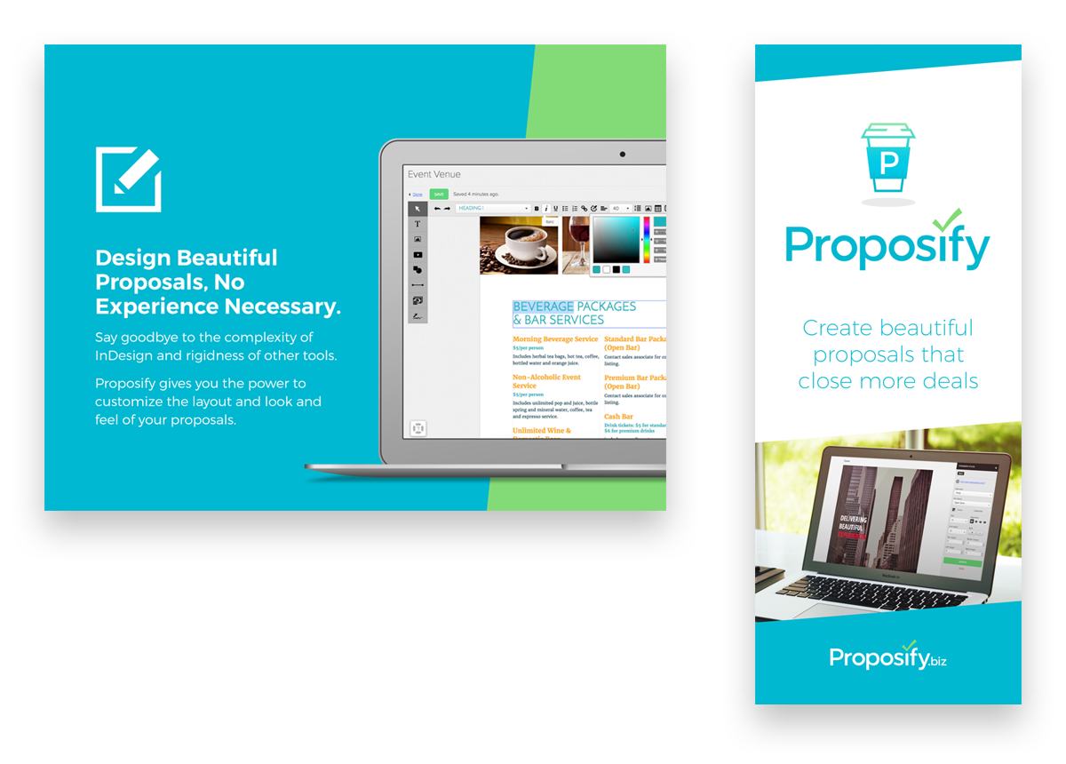
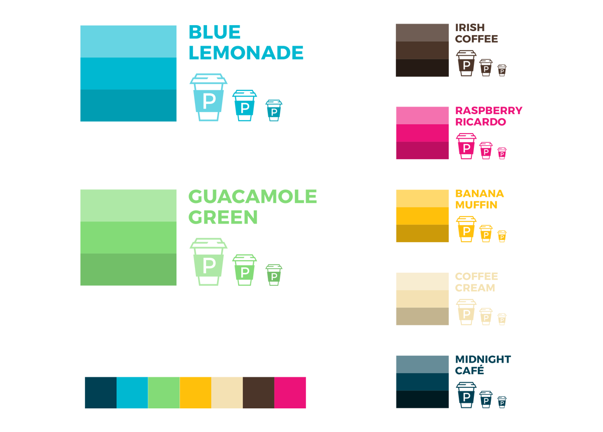
This worked fine on a technical level, but it didn’t really convey the full message of Proposify’s brand. Simple, sharp, and refined? Sure. But it was missing the personality, energy, and welcoming character that our customers have come to love about us. And that means it wasn’t unique — a surefire death sentence for any brand.
Thankfully two things happened at that time to push the brand in the right direction: The development of P, our company mascot, and the realization that some of the illustrative style we used in our blog images would give our brand the personality and welcoming style that it sorely needed.

Once that happened, the pieces started to fall into place, and the brand design became what it is today. In many ways it’s actually very different from where we began, despite our intention not to start from scratch. But by not abandoning what worked for the old brand, the transformation was a natural one that’s kept us true to our value proposition and brand promise.
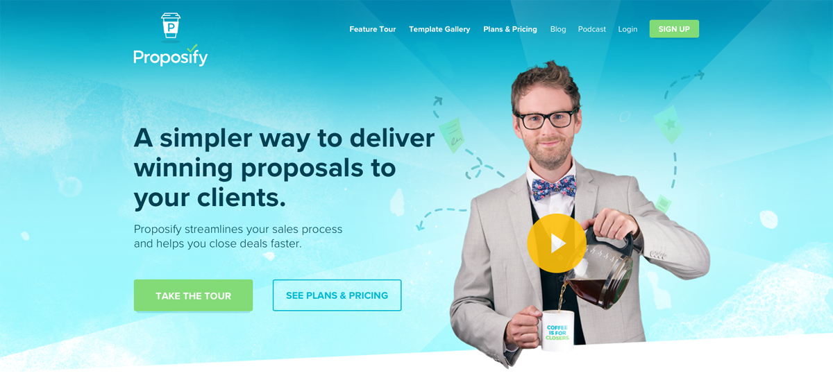
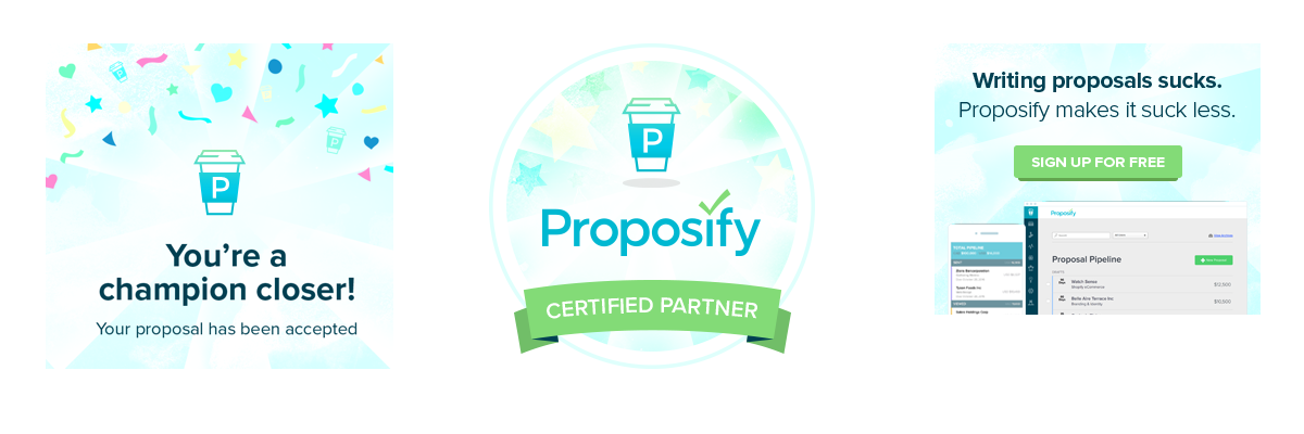
That’s not to say that Proposify’s brand can’t or won’t evolve in the future. It almost certainly will. Even now the brand design has been polished from when we landed on what we wanted. Just like Proposify itself, we’ll continue to improve and refine every day to ensure we’re delivering the best darn proposal software that ever existed.
— — — — — — — — — — — — — — — — — — — — — — — — — —
Thanks, Steve! See what I mean about him being designer extraordinaire?
The Birth of ‘P’
One more thing we’ve done so far in executing our new brand that I want to add to Steve’s list is that we brought Q to life through a Proposify filter. We wanted to create a new explainer video and this seemed like the perfect opportunity to introduce ‘P’, the embodiment of the Proposify brand, and everyone’s new proposal BFF.
I wrote the script and we worked with our talented friend Mike Hachey to produce a video that now lives on the homepage of our website. It stars ‘Carrie’, representing our smart, hardworking customers struggling to get a proposal out to a client, and our proposal hero, ‘P’.
You can watch it here:
Behind-the-scenes fun facts:
The video was shot in the Proposify office, located on a major downtown street here in Halifax, Nova Scotia. On the day we were set to shoot, Halifax hosted their annual Pride Parade which marched in all its loud and colourful glory right by our building. Because of the noise, we had to halt shooting of the video for TWO HOURS while the parade went by outside. The upside? The video cast and crew had a fantastic view of the parade from our 5th floor windows.
Also, can you spot the cameo Queen Elizabeth II makes in the video? I’m kind of a big fan and have a vintage photo of her coronation day from 1953 by my desk. We needed something on the wall in the background of the video so I volunteered the picture as my royal tribute.
The Results
“Results” kind of sounds like an end, and as we talked about before, a brand isn’t a finite thing. It should always be evolving and growing to match the values of your company and those of your stakeholders.
But in terms of anecdotal results, the most heartening reaction for me was how our team reacted to the idea of “Q” as Proposify’s brand code. It was really important that I developed something that they could relate to and feel proud about. Having your team on board with your brand is critical to any success.
Thankfully, the whole team loved the concept of Q and totally understood the analogy. The strongest proof of this was when, not long after we revealed the brand code, we were in a team meeting debating some thing or another and finally someone said, “What would Q do?”. And that settled it. We knew how Q would react to the situation we were discussing, so we did it.
While it’s too early to measure real conversion, we’ve received a lot of positive feedback on our new brand. It makes me excited to think about how we can use the brand code as inspiration for developing new ways to connect with our target audience.
I’m curious, what do you think of Proposify’s rebrand? I’d love to hear your feedback on what we’ve done and what your own experience has been with branding.
