How we repurposed content to create a 175-page ebook lead magnet
May 15, 2018Last updated on October 1, 2024

Lead magnets are a valuable form of content marketing. In exchange for high quality content, your ideal customer provides information like an email address so that you can retarget them about your product or service. Here’s how we upped our lead magnet game by repurposing our existing content into a comprehensive business book.
Leads, glorious leads.
We all want to produce the sweetest honey that attracts the buzziest bees, the juiciest worm that lands the biggest fish. Since the earliest of days when Proposify was only two founders and a CTO (sounds like the next great Netflix hit), we’ve experimented with —and heavily invested in —various forms of content marketing to attract and engage our target audience.
We have a robust blog, a podcast, videos, and a gallery of lead magnets in the form of free proposal templates. Everything is focused on providing high-quality content that our ideal customer is searching for; content that solves their problem-of-the-moment, or answers a pressing question.
Lead magnets are an especially valuable form of content marketing since, in exchange for that sweet honey, the bees you’re interested in provide information like an email address so that you can retarget them about your product or service.
Last year we decided to up our lead magnet game by creating an ebook. And not just a flimsy, 5-page checklist of an ebook. We wanted to create a comprehensive, beneficial business book that would be available in multiple formats including PDF, epub, mobi, as well as print.
We hadn’t done it before, but we also hadn’t created proposal software before Proposify either, and, well, so far so good. The truth is, we love to experiment, and since we had lots of existing content we felt confident that we could repackage into something our target audience would be interested in, we decided to jump right in.
So here’s how we created our first ebook lead magnet, and what we learned along the way:
Decide on your ebook topic
Actually, let’s back up a minute. To figure out what your book is going to be about, you first need to know who you want to attract with it. There’s no sense spending all that time and energy on something no one’s interested in reading. You need to know who your target audience is and what problems they’re looking to solve.
Here at Proposify, one of our target markets is agencies—marketing, design, web, advertising— and they make up a large percentage of our existing customer base. Agencies have to produce a lot of proposals to win new business, and we happen to have the (best) software to make the proposal process easier.
We also have already accumulated a lot of agency related content in our blog and podcast that we knew we could repurpose, so it made sense to choose a topic geared toward this industry.
Because Proposify’s co-founders Kyle Racki and Kevin Springer used to own an agency, and our entire marketing team worked at agencies, the challenges and needs of this type of business are familiar to us, so it was easy to brainstorm topics. Plus, we had a lot of intel from conversations with our agency customers.
The pain point we decided to focus on is how agency owners struggle to scale their business. Evolving from a one-person freelance practice into an agency or consultancy is challenging. You need to hire a skilled team, bring in enough business to pay that team, keep clients happy, do great work, AND somehow try to make a profit.
We also know that a lot of small agency owners wrestle with the endless details involved in running their business, and feel that they have to be involved in every one of them for things to be successful. What many business owners don’t realize is that to be truly profitable, they need to scale.
So we wanted to create a guide to show them how to grow their business without having their hands in every facet, freeing them up to concentrate on driving the vision and direction of the company.
As we wrote in the ebook intro:
We wrote this book for anyone who’s struggling with, dreaming about, and searching for ways to grow their business without sacrificing their soul, their sanity, and their life savings in the process.
Our advice is based on our personal experiences and on enlightening conversations we’ve had with other entrepreneurs on how to transform the manual, all-encompassing grind of running an agency into an automated, profitable, growing business.
Come up with your ebook title
So now that we had a topic, we needed a title. A good, catchy, title. I admit to having an adverse reaction to any suggestions of the ubiquitous “The Ultimate Guide to…” formula. And since we weren’t going to rely on people finding this ebook through organic search, we didn’t have to worry about cramming in specific keywords. We could be creative.
We knew we wanted the book title to communicate not only the topic of scaling a business but also the benefit. The idea that scaling leads to efficiency and efficiency leads to profitability; that your business should be able to run without you being involved in every detail. We wanted to combine the what with the why.
So after a round of brainstorming, we tentatively landed on: The Full Scale Agency: How to Build a Profitable Service Business that Makes Money While You Sleep.
It’s helpful to choose a title at the beginning of your writing or content curation process as it can act as a guide. but you want to be sure the content lives up to the promise of the title.
Here’s the important thing to remember about picking a title for your ebook: it can change.
In the process of writing the content, you may find that you need to revise your title, and that’s exactly what happened to us. As I started to put the content together I wasn’t sure that we were delivering advice on the ‘makes money while you sleep’ part.
So we tweaked the title slightly to The Full Scale Agency: How to Build a Profitable Business (Without Burning Out). We felt comfortable that this title was a more accurate description of the book and the content could deliver on the promise.
Repurpose Content
Does the ‘book’ part of ‘ebook’ terrify you? Maybe it conjures up images of being locked in a room for months on end as you try to bang out 50,000 of the most brilliant words every written.
Here’s the good news: you probably have most of your ebook already written.
If you’ve been building a blog, then you’re likely sitting on a goldmine of existing content that’s just waiting to be repackaged as an ebook. Not only is it totally acceptable to repurpose your content, but it’s also a smart marketing move. Repurposing content allows you to increase your ROI on the time and effort you put into creating in the first place.
When we started pulling our first ebook together, we had about four years of blog posts and podcast interviews to harvest. Thankfully, we weren’t going to have to start from scratch.
The first thing we did was create an outline of the process for scaling a business, the journey. Then we went through our blog and pulled every post our CEO Kyle Racki and I had written that was relevant to each heading of the outline and related to the idea of the agency business.
The outline then turned into chapters, and the blog posts populated the content of each chapter. There was some shuffling of the order to get the flow of the book right, along with making sure the most relevant information filled each chapter.
Here’s the truth about repurposing content for your ebook: I’ve read some articles out there that suggest you can create an ebook in ‘minutes’ by using existing content. While it’s true that it cuts down on a lot of time as compared to writing your ebook from scratch, you can’t just plunk your blog posts down, create a PDF, and you’re ready to rip.
Most posts will need to be revised. You may need to update some of the information, or it may be that some of it made sense in a stand-alone post, but now it isn’t relevant as part of the story you’re trying to tell in your ebook.
For example, sometimes we had personal anecdotes in our blog posts, but we didn’t feel they belonged in the book, so we cut them. Or the posts were written in the first person singular (I did this thing), and we wanted the book to be written in the first person plural (We did this thing).
Also, many of our blog posts were originally written to give advice directly to the doer, as in “You should do this”, but where the point of the book was to help the business run without the business owner, the tone was changed to read more like, “You need to train your team to do this.”
In hindsight, we discovered gaps in information in some chapters that we wanted to flush out a little more so I wrote new sections. There was also advice and quotes from some our podcast interviews that we integrated into the text.
If you think of your ebook like a quilt, your existing content are the patches of material. But they need to be stitched together to a create a cohesive, usable thing. Stitching those pieces together may mean writing chapter intros, conclusions, and other small pieces of content that give the ebook context and momentum.
Design your ebook
We’re lucky here at Proposify to have a great designer as part of our team. Steve Huntington doesn’t just create cool-looking stuff (although he does indeed do that), he’s also thoughtful about the power of design as a communication tool. Here he shares some of his reflections on designing our first ebook:
When we started designing The Full Scale Agency we knew that making its content as digestible as possible would ensure our readers got the most out of the book, keep them coming back to it again and again as a valuable resource, and hopefully share it with others.
Designing for screens, whether it’s a website, an application, or an ebook is all about accessibility. Your content should be killer, of course, but it also needs to be easily absorbed and understood, and that’s where good design comes in.
The most important aspect of accessibility on the web is typography: things like your choices in fonts, line-spacing, and text colour determines how readable your content is. Since most ebooks are almost entirely text, it’s a true typographic test of accessibility.
Sure, we could have just set The Full Scale Agency’s text in 10px Arial, sent it out to the world, and called it a day. But that would have been like sending a kid to their first day of school with no lunch or school supplies, and we’re not monsters here at Proposify.
Because we’re all about sharing, here are a couple of quick pointers on how to establish good typography that helped us create our ebook:
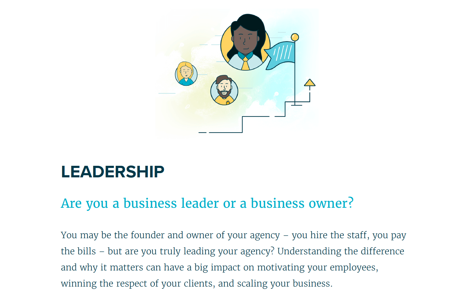
Hierarchy
Establishing a clear hierarchy between headings and body text is a must. This isn’t as complicated as it sounds; body text needs to be large enough to be readable (the size will depend on the font, but in general it should be larger than 16px), and chapter headings and subheadings are then larger and distinct from one another. You can do this using different fonts, or with colour - we did both.
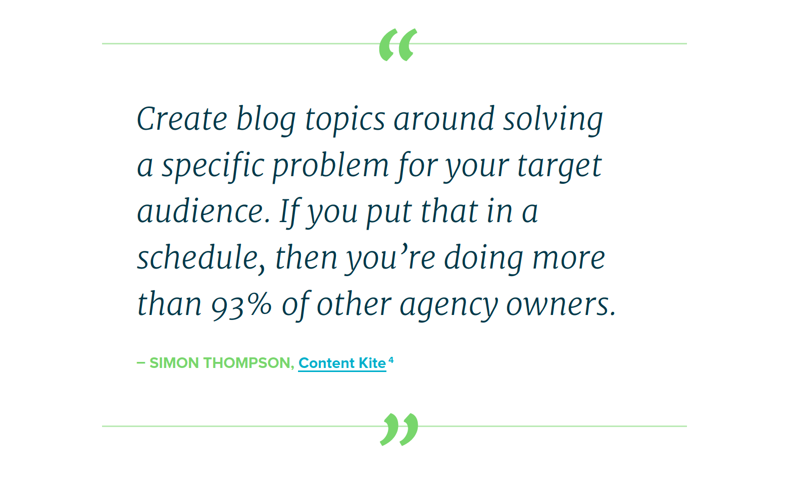
Pull quotes
We used pull quotes to call attention to our best bits of copy, break up large areas of continuous text, and give readers’ eyes a break. This allowed us to be flexible with our layout as we used some full-page pull quotes, and others fit inside the general flow of body text.
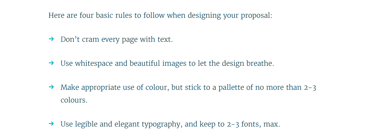
Lists
If you can turn a paragraph of text into a handy list instead, why wouldn’t you? It’s a more bite-sized, readable way of conveying content that is just as effective as a long-winded paragraph (maybe even more so).
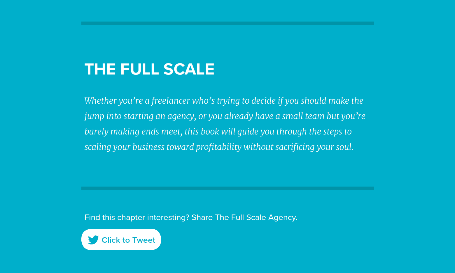
Reversed type
This is designer-speak for “white text on a coloured background.” Using reversed type is a fantastic way to feature blocks of information you want to call attention to, and like lists, it’s useful for breaking up the monotony of long paragraphs of text.
Get other eyes on the ebook
This was an important step in the evolution of The Full Scale Agency. Instead of assuming the book was readable, we had several Proposify team members who weren’t involved in this project give the book a read-through.
Turns out the text needed to be resized in several places, and we had yellow type on white in some areas that were downright painful to read. Getting more eyes on a draft of our ebook design allowed us to catch and fix issues before we released it into the wild.
There’s much more to typography than what we’ve covered here but if you’re considering creating your own ebook, the most important thing to remember about its design, as with the design of any web content you release, is that it’s not meant for you.
You already know the information you’re presenting - that’s why you’re writing an ebook. Your goal is to share your knowledge with others, so taking the care and attention to detail to make it clear and easy to understand will make it more attractive and valuable to the people you want to read it.
We could write an entire blog post on design tips (which we actually already did on proposal design, just in case you hadn’t heard:), but in the interest of efficiency here are some additional pointers:
Stay on brand
This is a no-brainer for any design team, but worth mentioning if you’re looking to create your own ebook, or working with hired designers. Hopefully, you’ve invested time and money in developing a solid brand for your company, and your ebook, just like everything else you do, should align with your brand.
Show, don’t tell
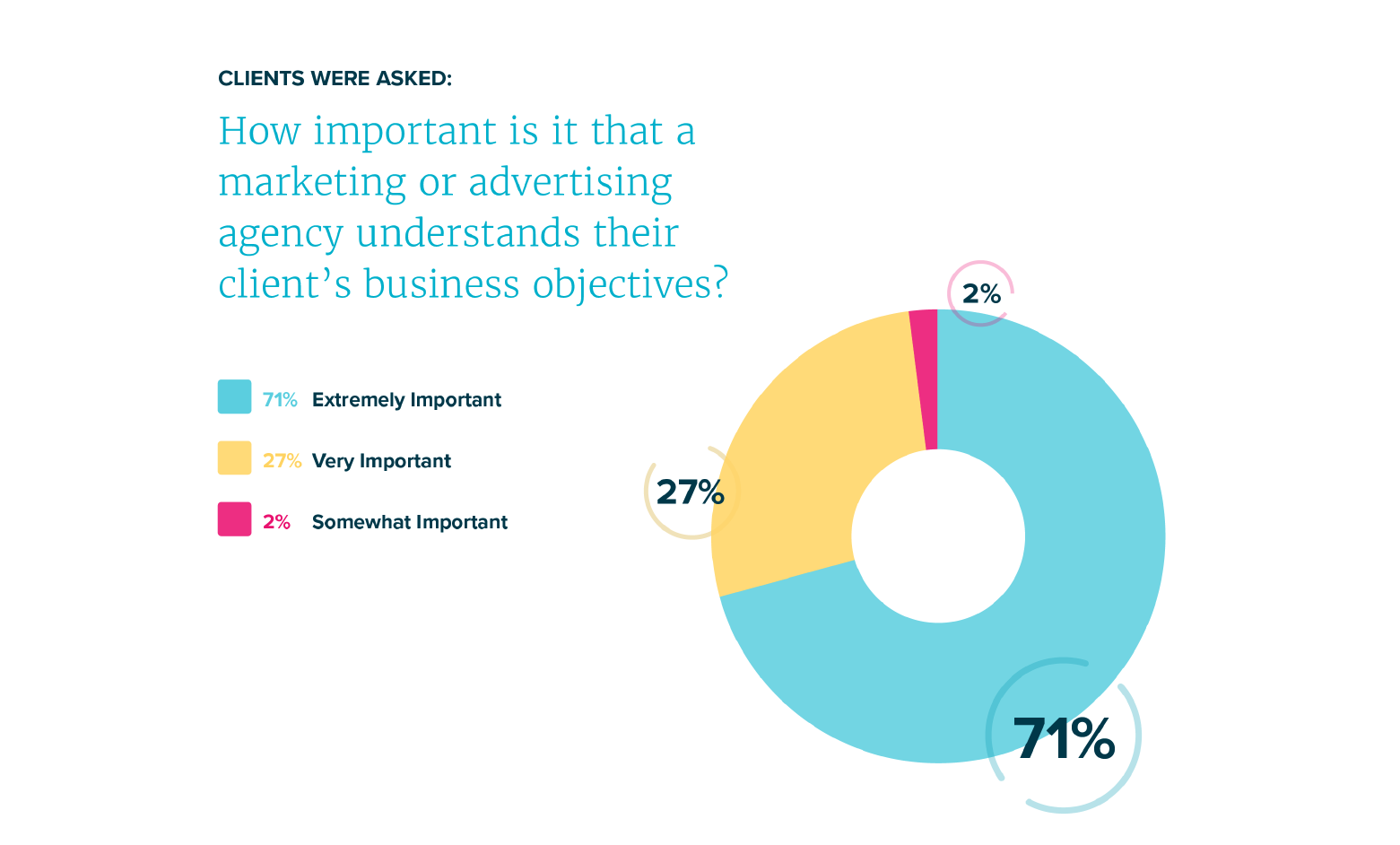
Okay, well you should still tell, but if you can use graphics, images, and charts in your book, you’ll be more effective at driving home your message.
Complicated ideas and concepts are much easier to parse when they’re represented with or accompanied by charts.
If you have a list of repetitive items or data you’d like to present, styling the list in a table or data in a graph is a much clearer way to do so, and makes it handy for your reader to refer back to in the future:
The fine details
Including a table of contents (with working links to the chapters), a copyright page to protect yourself, and a call-to action-page to inform readers about your product or service are all must-haves for a successful lead magnet ebook design.
You should also include page numbers, the book title and/or chapter title, and your logo in the headers and footers of your pages.
No designer? No problem.
You may not have an in-house designer to help you create your ebook, but don’t despair. You can always hire a freelance designer, or there are some DIY template options like Lucidpress and Canva.
Format your ebook
As I mentioned earlier, this was not only Proposify’s first time creating an ebook, it was also everyone on the marketing team's first time creating an ebook. We learned a lot as we went through the process and that includes the formatting stage, which fell to our marketing coordinator/designer, Lindsey Ward.
Here, Lindsey shares how she created a mobile-friendly version of our ebook and what she learned along the way:
An ebook is a unique beast. It’s not a printed book, or a glossy publication ripe with glamorous, floral perfume samples. It’s actually a web document, an Electronic Publication to be exact, exported to spit out beautifully (hopefully) crafted HTML and CSS. It’s interactive, mobile friendly, and responsive (if done correctly).
Choose your ebook format
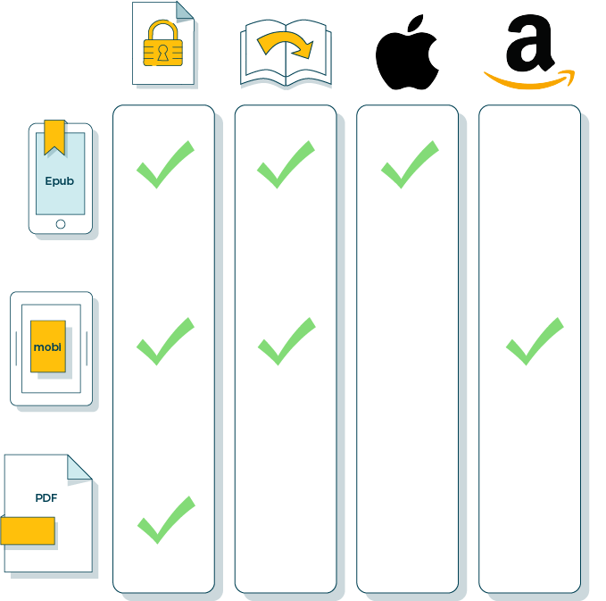
Our primary format for The Full Scale Agency is a PDF that people can view in their browser or download directly to their computer. But we wanted our book to be as accessible as possible so readers could consume the content from any kind of device in the easiest way possible.
Epub, mobi, and PDF formats all have their advantages and disadvantages. The largest differences are whether they are best optimized as fixed vs reflowable, and which devices they will work best on (Apple vs Kindle/tablet.)
Research is your best friend
If you’ve never created an ebook before, read up as much as you can on epubs and mobi file formatting. Find out what your ebook topic will require and how to get it looking as beautiful on your tablet as it does in your mind and PDF.
Here are some resources we found handy:
4 Ways to create an ePub eBook
How to Create an Interactive Ebook: A Step-By-Step Guide
Lynda.com has some great articles that take you through the whole process.
And, when all else fails, Youtube is at the ready to give you a hand.
Find examples of existing well-made ebooks and take a look at their design elements. Are they using lots of graphics? Interesting headers? Does it flow correctly across different mobile devices?
A combination of your research and good old-fashioned trial and error will help you get the formatting right, and while at times it may seem complicated, the payoff of a well designed and functioning ebook is worth it.
Talk to your designer
If you’re not the designer creating your ebook, stay in constant communication. It will save you time and anxious Google searches in the future. Everything from header logos, to font size and colour choice will affect how you prepare your ebook for epublication.
Test on multiple devices
If you’re creating your ebook in multiple formats, you need to test it on multiple devices to makes sure everything is doing what it should. Kindle, Amazon tablet, and iBook.
We don’t live in a strictly Apple world; mobi file formatting was created by Amazon for the tablet and Kindle crowd. As they own the rights to this brand of file, they have a converter for public use.
Once you’ve converted the PDF version of your ebook to an ePub file, then you can use Amazon’s converter to create your mobi file. This mobi converter does the trick, but not always with the best results as it can change your images and fonts. You really have no control over the file once it converts from an epub to mobi and that can be frustrating.
If your mobi file is looking wonky, go back to your epub file and use Calibre. This is a fairly old school ebook converter, but while it takes a bit of time and looks like your first Windows computer, it allows you more freedom to change your ebook’s code.
Calibre lets you dissect your book line by line (of code) and fix the wonk. Then you can take your fixed-up epub file back to the Kindle converter and turn it into a mobi file again. It’s a several step process, but necessary to achieve the final product.
There are a lot of elements to take into account when creating an ebook. You’ll need to set aside some time to strap in and run through the entire book page by page, testing out links, making sure images align properly, and that pages flow with ease.
You don’t have to DIY
If all of this sounds a little overwhelming and you don’t have the time or inclination to learn how to create multiple formats of your ebook, most print companies will convert your PDF into a mobile format for you.
The downside to this is that they generally don’t allow for graphics so you will end up sacrificing your design. Maybe you’re OK with just a text version of your ebook, but for us, we had a lot of graphics and other design elements that were an important part of The Full Scale Agency reading experience that we weren’t prepared to let go.
Print your ebook
We decided that to start we would stick with The Full Scale Agency as an actual ebook, that way we could capture leads through our landing page and move them into our sales funnel. However, we did decide to print about 200 copies to give out at conferences, trade shows, and other events we attend.
There are lots of self-publishing companies out there, and we decided on Blurb. There were a number of advantages to choosing Blurb, like the fact that if we eventually decided to print a large quantity of books, they would store them and handle fulfilment for us.
Blurb would also set up an ecommerce site if we decided to sell the books rather than give them away for free. And they assigned us a dedicated account manager we could contact directly for help.
Their price per book was reasonable even for the small run we did, and, unlike most companies, they provided us with a printed proof of our book. Their turn-around time was really impressive: we got our first physical proof within two days of sending them the files, and the actual printed books arrived within a week.
There were a few downsides with Blurb, however. The print quality isn’t awesome. We probably would have had more quality control with a local print company. They also have some limitations in their specs that seem strange, like not print on the book spine, and they didn’t give us much choice on the stock paper. But overall, we were pleased with the results.
Market your ebook
Now that the ebook is written, designed, and formatted, it’s time to set it loose in the world and try to attract those juicy leads. Our CMO Patrick Edmonds created a solid plan for promoting our ebook to just the right audience at just the right times.
As we outlined earlier, the whole point of creating The Full Scale Agency ebook was as an added-value supplement to our existing blog content. Content that’s already attracting thousands of readers per month, many of whom are finding Proposify’s content organically by searching for answers to questions on Google.
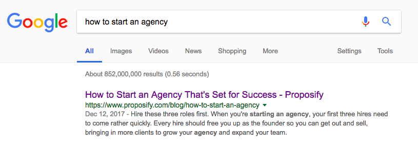
We create this content because we know that people in our target audience are looking for it. While our blog content is a great driver of top-of-funnel traffic, that traffic is typically unaware of Proposify and the benefits of proposal software, and aren’t in a buying mindset.
Lead magnets like our ebook allow us to continue the conversation with these cold leads, educate them on the benefits of proposal software, and qualify whether they might realize value from using Proposify.
Start with a landing page
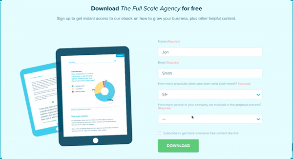
Since a lead magnet is an exchange of value between a business and consumer, we created a landing page that all ads for the ebook lead to. That’s where we ask users to provide four pieces of information in exchange for downloading the free ebook.
The name and email fields are fairly common and straightforward, but the following questions are very specific to Proposify. We ask the questions: “How many proposals does your team send each month?” and “How many people in your company are involved in the proposal process?”.
These questions allow us to qualify the lead to see if Proposify would be a solution they could benefit from. The larger the team creating proposals, the more proposals a lead is creating, and the more proposals a lead creates per month, the more value they can realize from Proposify.
Blog promotion
We added calls-to-action for The Full Scale Agency directly within relevant posts on our blog, directing readers to the landing page to download the ebook (you’ll probably find some while you’re reading this very post)
Facebook, Instagram, and LinkedIn
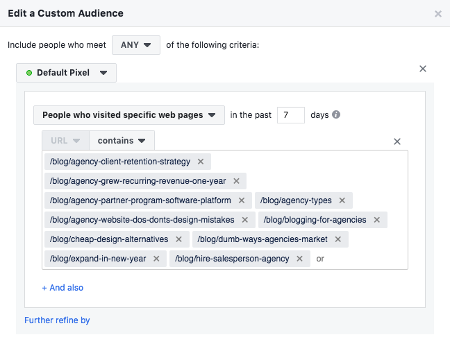
For The Full Scale Agency, we created custom audiences on Facebook and LinkedIn based on users who visited our blog posts or podcast episodes related to agencies, but who had NOT downloaded the ebook, or signed up for Proposify:
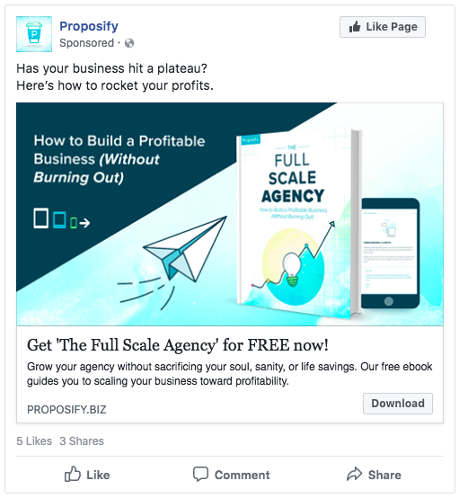
We then retarget users who have visited blogs related to that topic with ads promoting the ebook:
This retargeting tactic leverages the audiences who are already visiting our blog, but to grow the scale of who we can attract with our ebook, we needed to reach a broader audience. For this we leveraged Facebook’s “lookalike audiences” to target people who had similar interests and attributes to our customers, but were not our customers:
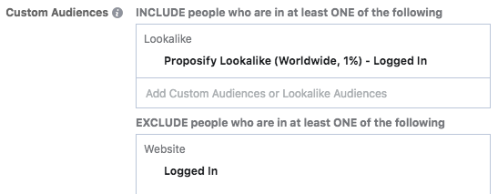
We narrowed this lookalike audience further to only target lookalikes of our customers who would be interested in reading the ebook. In this case, those who are interested in the agency space, but who are also business owners or executives:
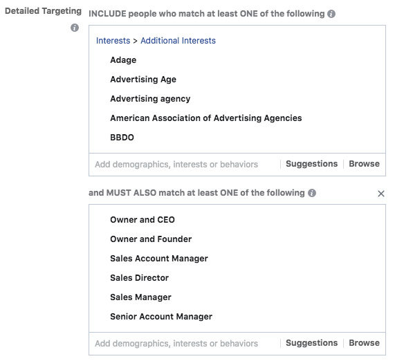
This lookalike audience allowed us to reach four times the number of users, and resulted in twice the number of downloads of the ebook than organic traffic alone, at a marginally higher cost per download.
Email Drip Campaign
Once our lead magnet promotion delivers potential leads to our landing page, and they opt-in to download our free ebook, it’s time to determine whether or not that lead is truly qualified; if they can benefit from Proposify and, hopefully, convert into a paying customer.
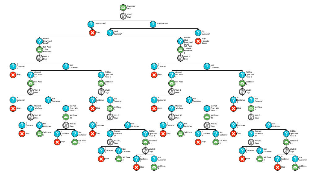
In an ideal world, our sales team would speak directly to each lead coming through the landing page, but we don’t have the capacity to do that. Instead, we use our custom questions on the landing page to segment out leads that are more qualified than others and send the best directly to our sales team for follow-up.
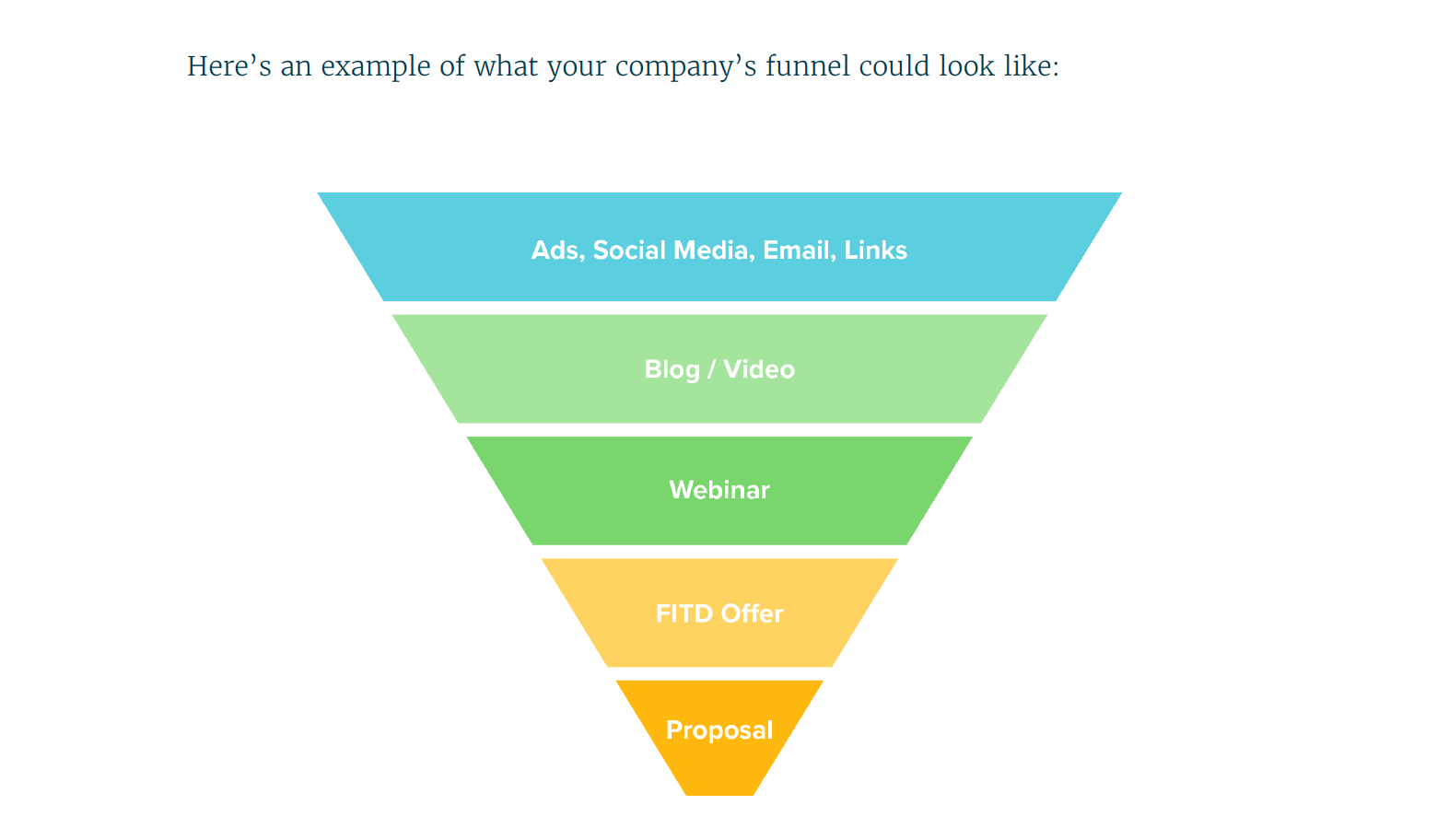
For the rest of the leads, we rely on automated email sequences to communicate information about Proposify, which started out looking something like the diagram below:
Within these emails, we reference the struggles that the lead is trying to solve as outlined in the book and directly link the solution to Proposify, like in this example of one of the first emails a lead receives:
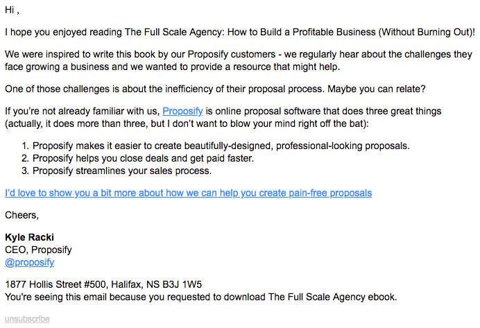
The goal of these emails is to educate the lead on the benefits Proposify provides. The first few emails direct the lead to learn more, while later emails in the sequence encourage the lead to start a free 14-day trial of the product.
Conclusion
We learned A LOT in the process of creating our first ebook lead magnet and in fact, we put it all to work again right away and recently released The Closer’s Guide to Winning Proposals
In the end, The Full Scale Agency: How to Build a Profitable Business (Without Burning Out) turned out to be a hearty 175 beautifully-designed pages of valuable and actionable advice. As one reader put it, “It’s not just a 23-page ebook. It definitely has gravitas, a “thud factor.”
We also received a great shout out from one of our podcast guests, Mandi Ellefson of The Hands-Off CEO:
The Full Scale Agency has been well-received by the people who count—our target audience. It’s resulted in several hundred leads per month with 83% of those leads considered qualified potential Proposify customers.
Leads, glorious leads.

Director of Communications @proposify. Channeling Maria Von Trapp, Queen Elizabeth II, and my taxi-driving, yard-sale-obsessed grandmother. Professional word nerd and unapologetic disciple of the Oxford comma. Connect on LinkedIn

![Winning Proposal Layout and Design Tips [With Examples]](https://www.proposify.com/hs-fs/hubfs/Imported_Blog_Media/blog-2017-10-24-proposal_layout_design_tips-Apr-09-2024-04-25-53-7811-PM.jpg?width=450&height=250&name=blog-2017-10-24-proposal_layout_design_tips-Apr-09-2024-04-25-53-7811-PM.jpg)
![8 Lead Magnet Ideas For Your Digital Agency [with Examples]](https://www.proposify.com/hs-fs/hubfs/Imported_Blog_Media/blog-2016-09-15-lead_magnet_ideas_agency-Apr-09-2024-05-38-49-7630-PM.png?width=450&height=250&name=blog-2016-09-15-lead_magnet_ideas_agency-Apr-09-2024-05-38-49-7630-PM.png)